2025.12.14
+
Typeface
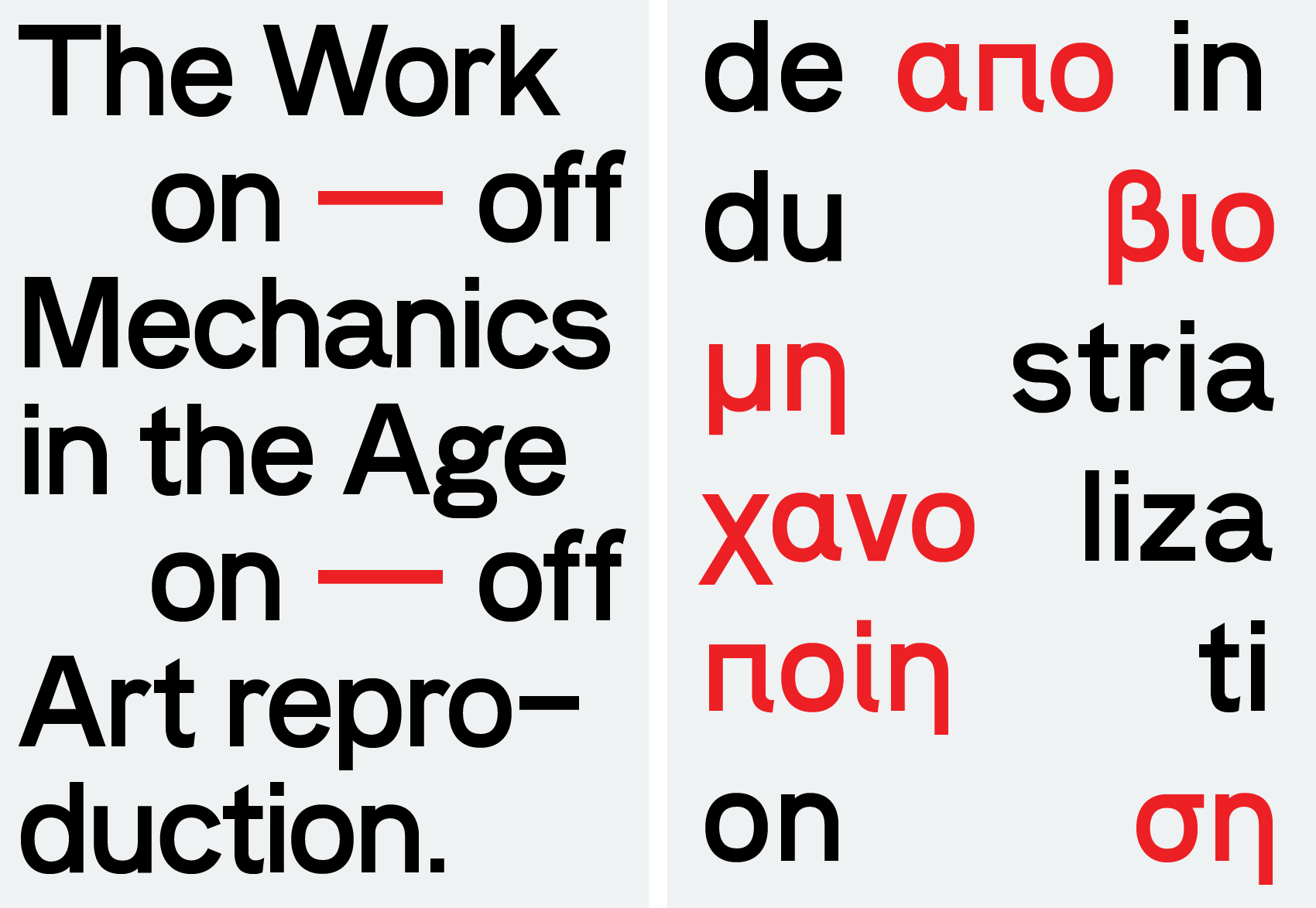
Vorzeit Grotesk

What we have understood of ‘grotesque’ (or grotesk in German) in the typographic context is, that it was originally a rather pejorative term. Perhaps we could compare it with the genesis of the term ‘impressionism’ as being first of all derogatory, used by the critic Louis Leroy of the Parisian journal Le Charivari, in response to the unfinished quality of Monet’s Impression: Sunrise of 1872.
The adj. grotesque comes from the French crotesque from the Italian grottesco, (lit. “of a cave,”), from grotta, from the Latin crypta (vault, cavern), which is a transliteration of the Greek crypte [crypt, hidden place; Gr: κρύπτη]. Initially the phrase “figura grottesca” (or “pitture grottesche”) was referring to the paintings of the caves.
The grotesque genre would describe series of typefaces that did alternate to the classic elegant serf typefaces. The reasons would probably be not be artistic at all but pure practical. Easy reproducible in small sizes while staying readable for example, and surly the bold, solid, straightforward construction of the letter forms would simplify the application in signing for instance. The twist in aesthetic perception towards grotesques started in the beginning of the 20st century and prolonged it self though-out the whole century in a wide international debate. Nowadays except from a long and complex story of definitions and redefinitions it seemed to us that more and more typographers and designers got obsessed whit the original feeling of the early grotesque letters. We can observe a still growing range of contemporary post neo-Grotesques. We have tried in our turn to do resume our observations as in a typical Grotesk typeface: ‘Vorzeit Grotesk’. Striking elements that could be named as inspirational are the almost jet not entirely equal letterforms. But what we have tried besides the regularized grotesque standards is to revivify the peculiar non-rational elements proper to the archetypical Grotesques. Perhaps those details where invented to give to so functional and ugly letterforms some sort of elegance. We have aimed in our interpretation, situated in the beginning of our twenty first century, to rediscover the innocent character typical to a debut-du-siècle attitude. A state of mind that could be described as a mix between optimism and despair, absolutism and relativity of clearness and an obscurity but most all a non refined open and almost childish elan in reformulating standards.