2026.06.21
+
Editorial
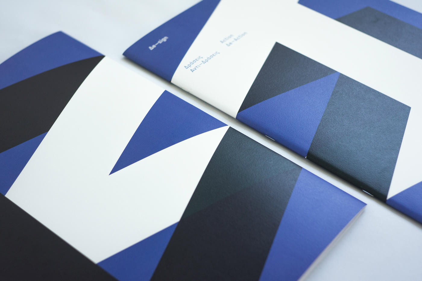
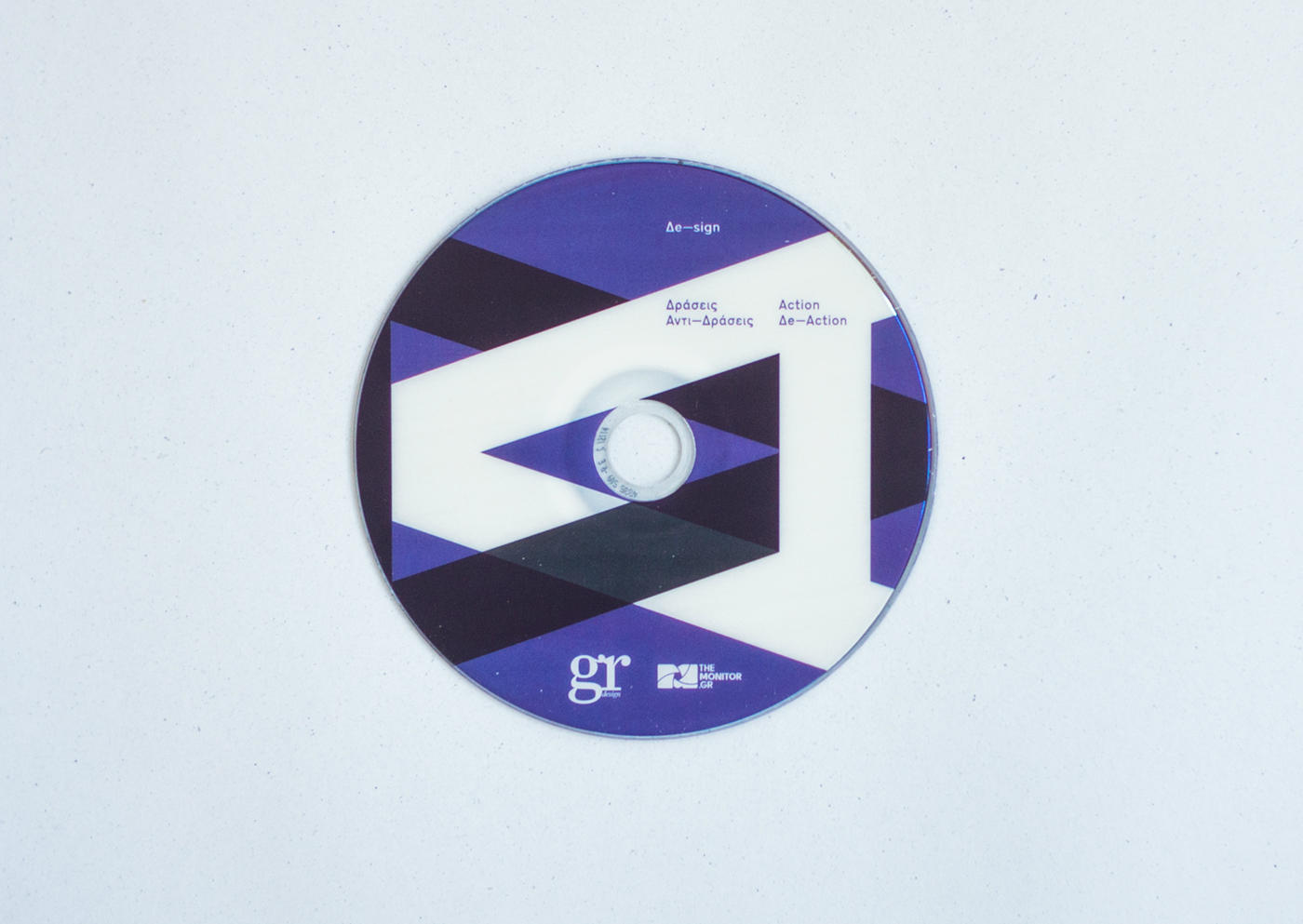
Gr Design, Δe-sign Action
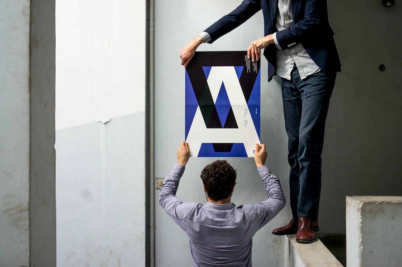
Gr design magazine asked us to design a cover for a brochure for their design exhibition organised in Benaki museum. The starting point was the title ‘Action’ and a typeface ‘Dromon medium’ a revisited ‘Transport’ released by Cannibal Fonts.
It did seem clear and very typical to us that when one says ‘action’ that we also say ‘re-action’. We casted, instead of only focusing on one side of the things, this dialectical entity ‘action-reaction’ to express a reflection on this universal principle. The capital A is typographically a perfect and fair antagonist of the protagonist capital Δ ( from the Greek word Δράσεις Αντί-Δράσεις meaning action-reaction). It seems that here are no coincidences the one is challenging the other and vise versa. This scene reflect in our sense quite well the world history and simply human existence : a continuous struggle of seemingly opposite forces and statements, that are finely if we look well, closely related figures in need of each other.
By a de constructivist gesture we observe finally that design should be read as : De-sign meaning de-sign-ification. In this process, that we call de-sign, we will never stop to turn and twist signs and types, upgrading or decreasing their value and meaning in order to confront us with an inexhaustible source of change inhabiting in our atoms.