2025.12.14
+
Typeface
Commons Mono


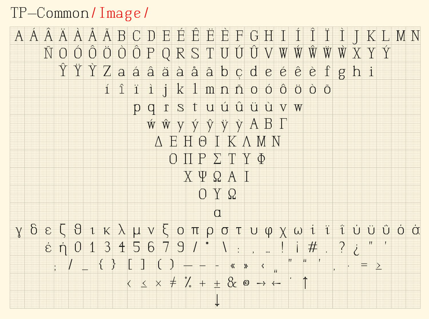
“Commons Mono” is a monospace display typeface existing out of 3 different variations on a 6×8 grid that is referring to the renaissance “octavo” format. “Commons Data” is build as an equal weighted line font often in use in technical drawings, “Commons Drawing” draws itself on the very same grid with typical modernist elements and “Commons Image” makes a free use of fragments deriving from roman or “antiqua” letter forms.
This typeface family was designed for “The School of Athens” an exhibition by curated Xristina Argyros and Ryan Neiheiser representing Greece at the Biennale Architettura 2018 in Venice. There proposal was studying the common spaces throughout a selection of fifty-six fundamental school buildings in a time frame of 2500 years, aiming to rethink the perception of the learning space. Since the thought was departing from the most typical embodiment of the spirit of the Renaissance “Scuola di Atene” painted by Raphael around 1500 we make within our approach a reference to that same period of “rebirth”.
Rethinking the classics was obviously accompanied with a spirit of reinvention, not only in the arts or architecture, but also very much in the sphere of printing, typography and medias of knowledge. Taking this reference as the starting point for our interpretation and contribution to the work of Argyros/Neiheiser we could think of the heritage from personalities such as Francesco Griffo, Nicholas Jenson and Aldus Manutius. We could argue that there work redefined basic concepts of written human civilization, starting from printing techniques and culminating in a complete new school of thought on the shape of the letter, evolving from gothic to a roman and italic letter forms. Aldus Manutius adopts the ‘octavo’ format to produce a portable and relatively affordable book format, a kind of proto-pocked size, addressing a wide audience and disrupting the exclusivity on books by the libraries of the church, nobles or royalty. This ‘octavo’ format could also be seen as a precursor of our well-known and much later DIN paper formats.
The by Argyros/Neiheiser used grid, organizing fifty-six 3D printed models of the schools within the Greek Pavilion, corresponded perfectly with the dimensions of the octavo ratio and seemed doubly confirming our work template. Consequently we designed a set of three monospace typefaces on this 6×8 grid, mapping three aspects of content: Data, Drawing and Image. With a quasi objective and anti-hierarchical attitude proper to the reinvention of Standards and Orders all the designed elements aspire to form an archive like space of reflection and study.


“TP common” was distinguished with Gold at the 2019 European design Awards